
Facebook headquarters is an amazing place. The snacks are free, the sun always shines and everyone is full of the best intentions. During my first week I encountered hundreds of people earnestly trying to make the world a better place. I also foresaw how easy it would be to adjust to this new normal and lose perspective. I made a quiet promise to not complain about anything ever and to remind myself of that commitment (should the micro kitchen ever run out of goldfish crackers), I hung a poster over my desk that said “stay humble.”
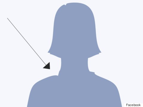
Much to my dismay, not long into my tenure as a Facebook designer I found something in the company glyph kit worth getting upset about. There in the middle of the photoshop file were two vectors that represented people. The iconic man was symmetrical except for his spiked hairdo but the lady had a chip in her shoulder. After a little sleuthing I determined that the chip was positioned exactly where the man icon would be placed in front of her, as in the “friends” icon, above. I assumed no ill intentions, just a lack of consideration, but as a lady with two robust shoulders the chip offended me.
I shared my complaint with a designer friend and she helpfully pointed me to the poster next to mine which proclaimed, “Nothing at Facebook is someone else’s problem.” The lady icon needed a shoulder, so I drew it in – and so began my many month descent into the rabbit hole of icon design.
After fixing her shoulder I was tempted to remove the Darth Vader-like helmet and give her hair some definition. Ponytails felt modern, if a little youthful, but at 32 pixels the pony resembled a small rodent more than a hairdo. Silhouettes with long hair or very full hair were similarly hard to disambiguate at reduced sizes and eventually I landed on a slightly more shapely bob.

In comparison to the new lady, the old man icon seemed stiff and outdated so I smoothed down his hair and added a slight slope to his shoulders. In updating the man I discovered the many places on Facebook where a single figure is used to represent an action, like in the “add friend” icon. It didn’t seem fair, let alone accurate, that all friend requests should be represented by a man, so I drew a silhouette for cases where a gendered icon was inappropriate.

Next, I was moved to do something about the size and order of the female silhouette in the “friends icon.” As a woman, educated at a women’s college, it was hard not to read into the symbolism of the current icon; the woman was quite literally in the shadow of the man, she was not in a position to lean in.
My first idea was to draw a double silhouette, two people of equal sizes without a hard line indicating who was in front. Dozens of iterations later, I abandoned this approach after failing to make an icon that didn’t look like a two headed mythical beast. I placed the lady, slightly smaller, in front of the man.
The old “groups” icon featured two men and one woman, the woman sat in the back left behind the larger centered man. It was an obvious refresh to use three unique silhouettes instead and, here again, I placed the lady first.

Moving Fast – With Help From Friends
Timidly, I saved out a new version of the glyph file, not sure if I was breaking any rules and half expecting a bunch of angry designers to message me asking why I was messing up Facebook’s glyph kit. Instead, and somewhat magically, the new icons began to appear in new products across the company and our many platforms.
Matt Sain, a front end engineer, dropped the new male and female silhouettes into desktop web for employees and then shipped them to the whole world without much fanfare. Lexi Ross, a Product Manager, hacked several much needed additions to Male and Female gender options in profile creation and added the corresponding alternative silhouettes. Brian Frick, master of icons, updated the entire glyph kit about six months ago, re-working and adding many new icons, informally adopting the new people icons in his work.

It turns out this kind of self-initiated project is not unique at Facebook. Last year, designer Julyanne Liang worked with engineer Brian Jew to give the non-American half of the globe an accurate world view from the notification icon. Since then they’ve added an Asia-centric globe, too.

Symbols Matter
As a result of this project, I’m on high alert for symbolism. I try to question all icons, especially those that feel the most familiar. For example, is the briefcase the best symbol for “work”? Which population carried briefcases and in which era? What are other ways that “work” could be symbolized and what would those icons evoke for the majority of people on Earth?
All those good intentions I met on the first day were real. We all want to continue to make Facebook the best it can be, to have culture of doing rather than complaining, to grow a company where ideas can spread organically, and to build a platform that is relevant for people from it’s core features down to the smallest of icons.
Have ideas about other icons that could use a refresh? Send me a note, I’d love to hear them.